Background Removal
Jewelry Lookbooks on Graphite: Keep Sparkle, Do Not Lose the Silhouette
Put a ring or watch on controlled black for the brand site. Skip pure black when the piece is matte black — and keep marketplace main images white.
Written by Backgroundcanvas Editorial, the team that builds these image tools. We disclose that affiliation here. Platform sizes and rules below come from the linked official docs, not from a lab bake-off.
The PDP still shows a napkin
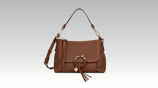

Lookbooks, watch heroes, and a premium gadget page lean on graphite so metal and stone read expensive. A velvet tray and two lights are ideal; reality is a phone close-up on a kitchen napkin while Shopify is tonight. The job is to isolate the ring, bracelet, or watch and swap to a controlled black that matches your hex — not a flash-sale crimson (that is the sale-banner article), and not a deceptive Amazon main image. Search grids that want white stay white. Graphite is for the brand site and the lookbook PDF.
Cut the metal; watch the fringe
Upload the close-up. Isolate prongs, bezels, and chain links. Inspect at 100%. White fringes against charcoal look cheap. Swap to solid black, soft graphite, or a slight vignette — not marble that fights fire in a diamond. If a supplier mark sits on the tag, that is a watermark after the cutout. Do not brush the stone. Do not invent extra melee. If the product is mostly matte black (earphones, cases, ink), skip pure black or add a charcoal gradient so the silhouette stays readable.
Cast, files, and crops
Warm drywall yellows silver and white diamonds. Check before export. Uploads accept JPG, PNG, WebP, or AVIF up to 10MB and 6000×6000 px. A 2400 px JPEG under 4MB typically returns in under 60 seconds. Export a 4:5 for the PDP, a square for the grid, and a wide lookbook slide from the same still. Name files `sku-lookbook-black.png` versus `sku-market-white.jpg`. Do not stretch a napkin shot into a 4000 px print file; reconstruction will not invent micro-pavé.
Sparkle versus compression
Shopify will recompress. Inspect fire in the stone at half size. If the reconstructed area turns to mush, relink the original or reshoot under a single window. A second auto pass will not invent facets. Skip motion-blurred handhelds. Skip 400 px WhatsApp forwards from a caster.
Rights and honest metal
Only edit photos you shot or that a vendor licensed. Cleaning your napkin still is production. Lifting another jeweler’s macro is not — and the customer with a loupe will notice. Do not reconstruct a scratch you will ship. Do not clone a second ring into the frame to look like a set you do not sell.
Batch by metal color
Yellow gold, white gold, and steel want the same graphite so the collection page is one brand. Process ten SKUs, one hex. When the collection is live and the hero still sits on a cluttered desk, isolate the piece, swap to jewelry black, and leave the sale-red file in another folder.
Watches and gadgets
A watch PDP can share the graphite habit if the case does not disappear. Crown, lugs, and strap stitching need a readable edge. If the only still is on a hairy wrist in a car, isolate only if the client cleared a product-only crop — otherwise shoot a tray still. When the lookbook is due and the napkin is still in the JPEG, put the metal on graphite and keep the silhouette.
Macro versus lifestyle
A prongs-and-stone macro on graphite is the lookbook. A wrist still in daylight is the scale shot. Do not isolate the wrist still onto graphite and imply a studio tray if the only licensed file is on-body. On-body needs a model release. Tray stills do not. Keep both in the listing: graphite hero, honest scale.
Rhodium and yellow gold
Yellow gold on pure black can look brown on cheap phones. A slightly lifted charcoal often reads more like metal. Test on a phone before you ship the lookbook. When the collection is live and the napkin is still in the JPEG, isolate the piece, pick graphite, and skip the velvet CGI you do not own.
Chain length and scale
A 16-inch chain on graphite still needs a ruler or a neck still somewhere in the listing. Isolation of the clasp is not a substitute for length in the description. Do not clone extra links. When the lookbook is due and the napkin is still in the JPEG, put the metal on graphite and keep the silhouette readable.
Certificates and hallmarks
A hallmark on the inner band is a detail still, not something to reconstruct onto the graphite hero. Photograph it separately. Isolation of the face of the ring is the lookbook. Do not paint a fake stamp. When the page needs luxury and the tray is a napkin, isolate the piece, pick graphite, and skip the fake velvet you do not own.
Returns and loupes
A customer with a 10x loupe is comparing the stone to the JPEG. Isolation of a napkin is presentation. Reconstructing extra fire is a return. Keep the as-shot next to the lookbook file. Graphite should make metal readable, not make the piece look like a different grade.
When the page needs luxury and the tray is a napkin, isolate the piece, pick graphite, and skip the fake velvet you do not own.